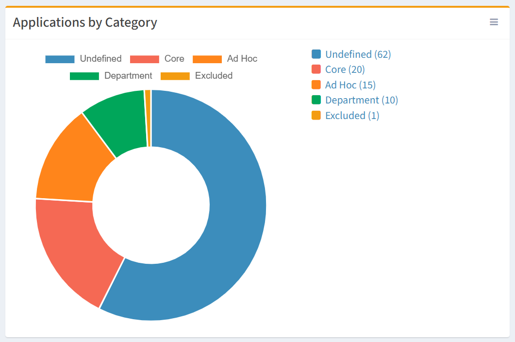
In the example below, we are creating a simple pie chart to represent Applications by Category.
From the Charts tab, you can create simple pie charts. To create:
- Click the New Chart button to bring up the New Chart wizard
- Enter the properties of the new chart
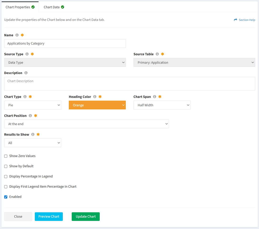
- Name – Applications by Category
- Source Type – Data Type
- Source Table – Primary: Application
- Description – This field was left blank
- Chart Type – Pie
- Heading Color – Orange
- Chart Span – Half Width
- Chart Position – At the end
- Results to Show – All
- Show Zero Values – NO. This will omit all zero values from the chart legend.
- Show by Default – NO
- Display Percentage In Legend – NO
- Display First Legend Item Percentage In Chart – NO
- Enabled – YES
- Select the data columns and filters of the new chart
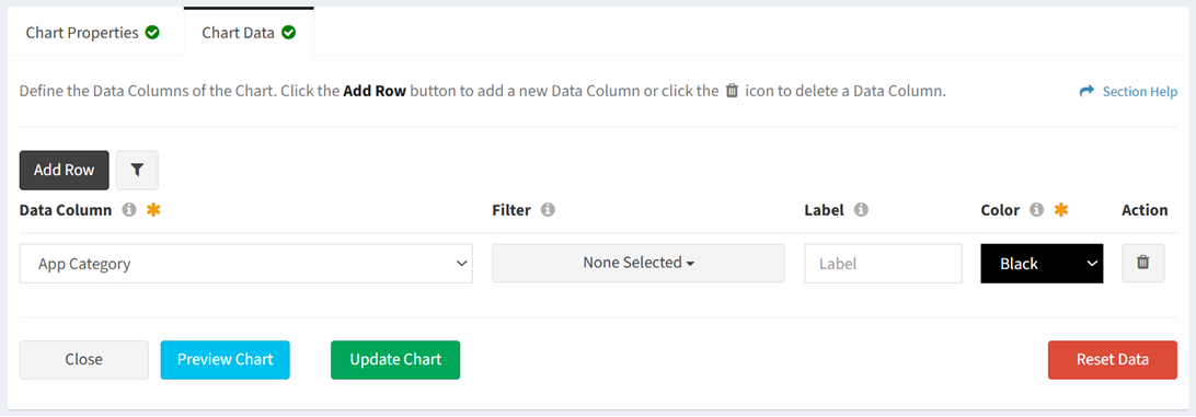
- Data Column – App Category
- Filter – None selected. This will display all App Category values on the chart.
- Label – The label was left blank. The field is ignored unless one or more filter values are selected.
- Color – Black. The field is ignored unless one or more filter values is selected.
- Secondary Filter – Not applicable for this example
- Click the Preview Chart button to preview the chart before saving. Click the Close button to exit the chart preview.
- Click the Create Chart button when finished to create the chart. You will be redirected back to the Charts tab. Click the Cancel button to cancel the operation.
- The Applications by Category pie chart is shown below: