
Search Knowledge Base by Keyword
-
Introduction
-
Fundamentals
-
My ReadyWorks
-
Analytics
-
-
-
- Available Reports
- All Data Types
- Application Certification Status
- Application Discovery
- Application Group Analysis
- App Group to SCCM Collection Analysis
- Application Install Count
- Application License Management
- Application Usage
- Data Type Column Mappings
- Record Count by Property
- Data Links Count by Data Type
- Build Sheet
- Computer User Assignment
- Delegate Relationships
- ETL5 Staging Data
- Migration Readiness (Basic)
- Migration Readiness (Complex)
- O365 License Management
- O365 Migration Readiness
- Patch Summary
- SCCM OSD Status
- Scheduled Computers by Wave
- Scheduled Users by Manager
- User Migration Readiness
- VIP Users
- Wave & Task Details
- Wave Group
- Windows 10 Applications
- Show all articles ( 14 ) Collapse Articles
-
-
-
-
Orchestration
-
Data
-
-
- View Primary Data
- Record Properties
- Images
- Notes
- Waves
- Tasks
- Attachments
- History
- Rationalization
- QR Code
- Linked Records
- SCCM Add/Remove Programs
- Altiris Add/Remove Programs
- Related Records
- Advanced Search
- Relationship Chart
- Primary Data Permissions
- Show all articles ( 2 ) Collapse Articles
-
Integration
-
-
-
- View Connection
- Connection Properties
- Make Into Connector
- Delete Connection
- Connection Error Settings
- Inbound Jobs
- Outbound Jobs
- New Inbound Job
- New Outbound Job
- Job Error Settings
- Enable Job
- Disable Job
- Edit Inbound Job
- Edit Outbound Job
- Upload File
- Run Inbound Job
- Run Outbound Job
- Set Runtime to Now
- Reset Job
- Delete Job
- Job Log
- Show all articles ( 6 ) Collapse Articles
-
-
- View Connector
- Connector Properties
- Authentication Methods
- New Authentication Method
- Authentication Method Error Settings
- Edit Authentication Method
- Delete Authentication Method
- Fields
- Edit Field
- Inbound Job Fields
- Edit Inbound Job Field
- Inbound Job Templates
- New Inbound Job Template
- Job Template Error Settings
- Edit Inbound Job Template
- Delete Inbound Job Template
- Outbound Job Fields
- Edit Outbound Job Field
- Outbound Job Templates
- New Outbound Job Template
- Edit Outbound Job Template
- Delete Outbound Job Template
- Show all articles ( 7 ) Collapse Articles
-
-
- ETL5 Connector Info
- Absolute
- Azure Active Directory
- Comma-Separated Values (CSV) File
- Generic Rest JSON API
- Generic Rest XML API
- Ivanti (Landesk)
- JAMF
- JSON Data (JSON) File
- MariaDB
- Microsoft Endpoint Manager: Configuration Manager
- Microsoft SQL
- Microsoft Intune
- Oracle MySQL
- PostgreSQL
- Pure Storage
- ServiceNow
- Tanium
- XML Data (XML) File
- JetPatch
- Lenovo XCLarity
- Nutanix Move
- Nutanix Prism
- Nutanix Prism - Legacy
- RVTools
- Simple Object Access Protocol (SOAP)
- VMware vCenter
- VMware vCenter SOAP
- Show all articles ( 13 ) Collapse Articles
-
-
Admin
-
-
-
- Modules
- Attachments
- Bulk Edit
- Data Generator
- Data Mapping
- Data Quality
- ETL
- Form Builder
- Images
- Multi-Factor Authentication
- Notifications
- Rationalization
- Relationship Chart
- Reports
- Rules
- Single Sign-On
- T-Comm
- User Experience
- Show all articles ( 4 ) Collapse Articles
-
-
API
-
Administration
-
FAQs
-
Solutions
New Chart
< Back
From the Charts tab, you can create charts. To create:
- Click the New Chart button to bring up the New Chart wizard
- Enter the properties of the new chart
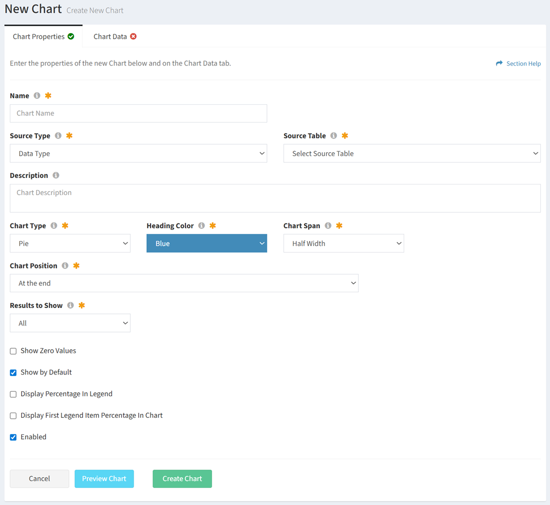
- Name – Name of the chart (required)
- Source Type – Type of the source data table for the chart (required)
- Different options are available depending on the type of source:
- Data Type – Use a data type (primary or secondary) as the source for the chart

- Source Table – Name of the source data type for the chart (required)
- Report – Use a report as the source for the chart
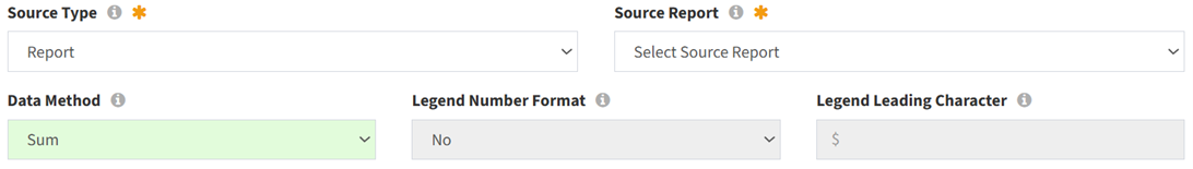
- Source Report – Name of the source report for the chart (required)
- Data Method – Data method of the chart (Sum or Value) (optional)
- Sum – Total for each value in a data column (e.g., Computers in New York)
NOTE: Sum is the data method used when Data Type is selected as the Source Type. - Value – Value in a data field (e.g., Annual Cost of HR Software)
- Sum – Total for each value in a data column (e.g., Computers in New York)
- Legend Number Format – Choose if chart legend values are formatted as numbers (e.g., 1,000.00) (optional)
- Legend Leading Character – Enter character to prepend to chart legend values (e.g., $) (optional)
- Data Type – Use a data type (primary or secondary) as the source for the chart
- Different options are available depending on the type of source:
- Description – Description of the chart (optional)
- Chart Type – Type of the chart (Pie, Bar, Area) (required)
- Index Axis – Index axis of the chart (Vertical, Horizontal) (required)
NOTE: Only available on Bar charts. - Heading Color – Color of the heading bar on the chart (only default colors are available from the drop down) (required)
- Chart Span – Spanning of the chart on the dashboard (Half Width, Full Width) (required)
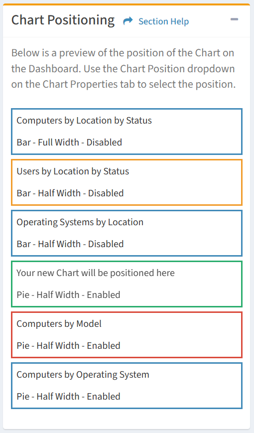
- Chart Position – Select the chart this chart will display before or after. The chart position is displayed on the right side of the wizard. (required)
- Results to Show – Choose to show all results or limit to a number (e.g. show the top five values) (required)
- Show Legend – Choose if the legend is displayed on the chart (optional)
NOTE: Only available on Bar and Area charts. - Show Zero Values – Choose if items with zero values are displayed on the chart (e.g. No Computers with a particular Migration Status) (optional)
- Show by Default – Choose if the chart is displayed by default on a ReadyWorks user’s dashboard (optional)
- Display Percentage in Legend – Choose if percentages are displayed in the chart legend (optional)
NOTE: Only available on Pie charts. - Display First Legend Item Percentage in Chart – Choose if the percentage of the first legend item is displayed in the center of the chart (optional)
NOTE: Only available on Pie charts. - Enabled – Choose if the chart is enabled (optional)
- Select the data columns and filters of the new chart
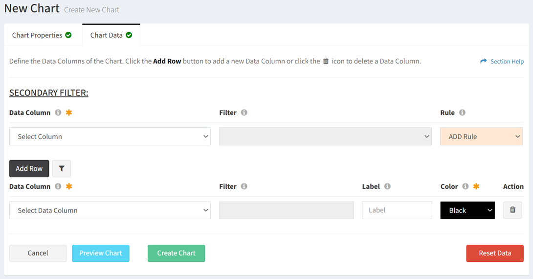
- Data Column – Name of the data column (required)
- Filter – Name of the value to filter for the data column (optional)
- Label – Name of the data column in the chart legend (optional)
- Color – Color of the data column on the chart (required) (i.e. slice of the pie, bar, area line)
- Action – Delete a data column from the chart
- Add Row – Add new rows for additional data columns
- X-Axis (required for bar and area charts, not applicable to pie charts)
- Data Column – Name of the x-axis data column (required)
- Filter – Name of the value to filter for the x-axis data column (required)
- Color – Color of the data column on the x-axis
- Label (required for value data method, not applicable to sum data method)
- Data Column – Name of the label data column (required)
- Filter – Name of the value to filter for the label data column (required)
- Color – Color of the data column on the label
- Secondary Filter (optional)
- Show/Hide Secondary Filter – Show or hide the secondary filter
- Clear Secondary Filter – Clear the secondary filter
- Column Name – Name of the secondary data column (required for secondary filter)
- Filter – Name of the value to filter for the secondary data column (required for secondary filter)
- ADD Rule – Add more secondary filters
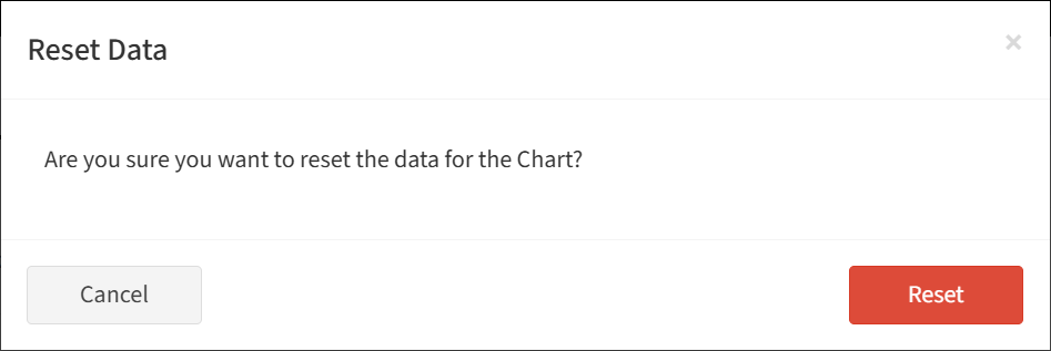
- Click the Reset Data button to clear all data columns. Click the Reset button to confirm the reset operation. Click the Cancel button to cancel the operation.
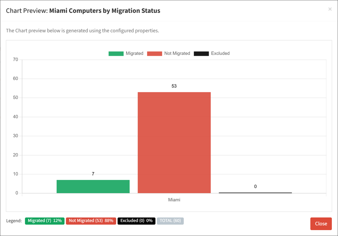
- Click the Preview Chart button to preview the chart before saving. Click the Close button to exit the chart preview.
- Strikethrough a data column to temporarily hide it from the chart preview

- Strikethrough a data column to temporarily hide it from the chart preview
- Click the Create Chart button when finished to create the chart. You will be redirected back to the Charts tab. Click the Cancel button to cancel the operation.