Search Knowledge Base by Keyword
-
Introduction
-
Fundamentals
-
My ReadyWorks
-
Analytics
-
-
-
- Available Reports
- All Data Types
- Application Certification Status
- Application Discovery
- Application Group Analysis
- App Group to SCCM Collection Analysis
- Application Install Count
- Application License Management
- Application Usage
- Data Type Column Mappings
- Record Count by Property
- Data Links Count by Data Type
- Build Sheet
- Computer User Assignment
- Delegate Relationships
- ETL5 Staging Data
- Migration Readiness (Basic)
- Migration Readiness (Complex)
- O365 License Management
- O365 Migration Readiness
- Patch Summary
- SCCM OSD Status
- Scheduled Computers by Wave
- Scheduled Users by Manager
- User Migration Readiness
- VIP Users
- Wave & Task Details
- Wave Group
- Windows 10 Applications
- Show all articles ( 14 ) Collapse Articles
-
-
-
-
Orchestration
-
Data
-
-
- View Primary Data
- Record Properties
- Images
- Notes
- Waves
- Tasks
- Attachments
- History
- Rationalization
- QR Code
- Linked Records
- SCCM Add/Remove Programs
- Altiris Add/Remove Programs
- Related Records
- Advanced Search
- Relationship Chart
- Primary Data Permissions
- Show all articles ( 2 ) Collapse Articles
-
Integration
-
-
-
- View Connection
- Connection Properties
- Make Into Connector
- Delete Connection
- Connection Error Settings
- Inbound Jobs
- Outbound Jobs
- New Inbound Job
- New Outbound Job
- Job Error Settings
- Enable Job
- Disable Job
- Edit Inbound Job
- Edit Outbound Job
- Upload File
- Run Inbound Job
- Run Outbound Job
- Set Runtime to Now
- Reset Job
- Delete Job
- Job Log
- Show all articles ( 6 ) Collapse Articles
-
-
- View Connector
- Connector Properties
- Authentication Methods
- New Authentication Method
- Authentication Method Error Settings
- Edit Authentication Method
- Delete Authentication Method
- Fields
- Edit Field
- Inbound Job Fields
- Edit Inbound Job Field
- Inbound Job Templates
- New Inbound Job Template
- Job Template Error Settings
- Edit Inbound Job Template
- Delete Inbound Job Template
- Outbound Job Fields
- Edit Outbound Job Field
- Outbound Job Templates
- New Outbound Job Template
- Edit Outbound Job Template
- Delete Outbound Job Template
- Show all articles ( 7 ) Collapse Articles
-
-
- ETL5 Connector Info
- Absolute
- Azure Active Directory
- Comma-Separated Values (CSV) File
- Generic Rest JSON API
- Generic Rest XML API
- Ivanti (Landesk)
- JAMF
- JSON Data (JSON) File
- MariaDB
- Microsoft Endpoint Manager: Configuration Manager
- Microsoft SQL
- Microsoft Intune
- Oracle MySQL
- PostgreSQL
- Pure Storage
- ServiceNow
- Tanium
- XML Data (XML) File
- JetPatch
- Lenovo XCLarity
- Nutanix Move
- Nutanix Prism
- Nutanix Prism - Legacy
- RVTools
- Simple Object Access Protocol (SOAP)
- VMware vCenter
- VMware vCenter SOAP
- Show all articles ( 13 ) Collapse Articles
-
-
Admin
-
-
-
- Modules
- Attachments
- Bulk Edit
- Data Generator
- Data Mapping
- Data Quality
- ETL
- Form Builder
- Images
- Multi-Factor Authentication
- Notifications
- Rationalization
- Relationship Chart
- Reports
- Rules
- Single Sign-On
- T-Comm
- User Experience
- Show all articles ( 4 ) Collapse Articles
-
-
API
-
Administration
-
FAQs
-
Solutions
Simple Bar Chart
< Back
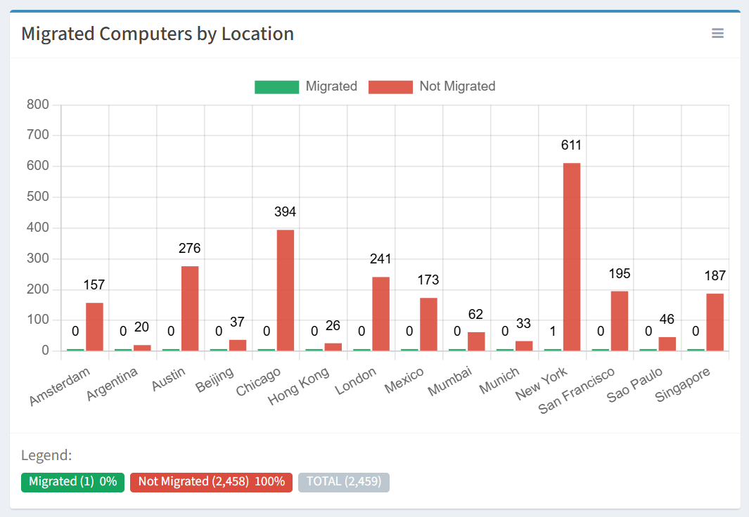
In the example below, we are creating a simple bar chart to represent Migrated Computers by Location. The chart filters on Computers in the Migrated and Not Migrated status across selected Locations.
From the Charts tab, you can create simple bar charts. To create:
- Click the New Chart button to bring up the New Chart wizard
- Enter the properties of the new chart
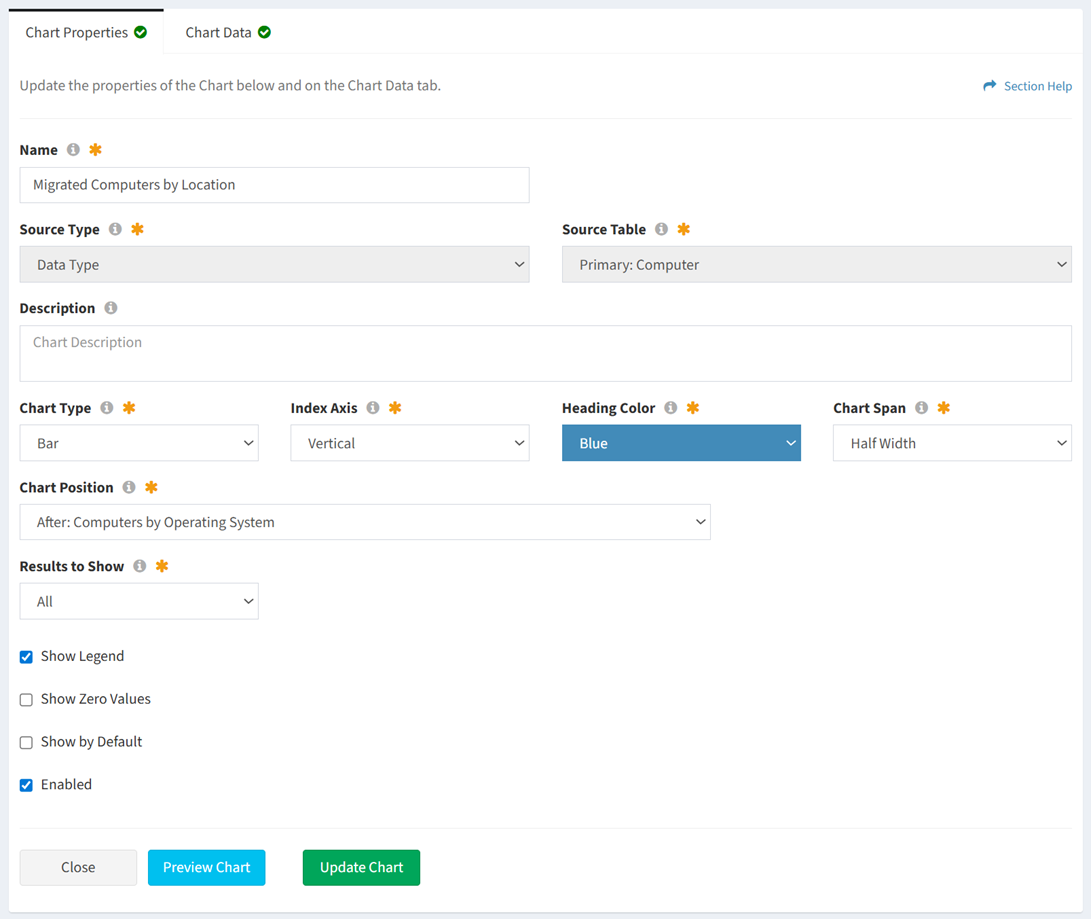
- Name – Migrated Computers by Location
- Source Type – Data Type
- Source Table – Primary: Computer
- Description – This field was left blank
- Chart Type – Bar
- Index Axis – Vertical
- Heading Color – Blue
- Chart Span – Half Width
- Chart Position – After: Computers by Operating System
- Results to Show – All
- Show Legend – YES
- Show Zero Values – NO. This will omit all zero values from the chart legend.
- Show by Default – NO
- Enabled – YES
- Select the data columns and filters of the new chart
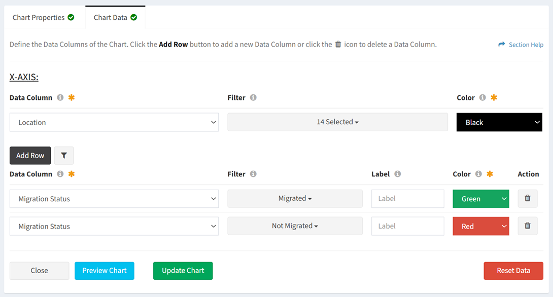
- Data Column 1 – Migration Status
- Filter – Migrated
- Label – The label was left blank. The name of the filtered selected will be displayed as the name of the chart element (i.e. Migrated). Use this field to change the name displayed for the element on the chart.
- Color – Green
- Data Column 2 – Migration Status
- Filter – Not Migrated
- Label – The label was left blank. The name of the filtered selected will be displayed as the name of the chart element (i.e. Not Migrated). Use this field to change the name displayed for the element on the chart.
- Color – Red
- X-Axis
- Data Column – Location
- Filter – Multiple Locations selected. Use the field to filter the Locations displayed across the x-axis (horizontal) of the chart.
- Color – Black. The field is ignored.
- Secondary Filter – Not applicable for this example
- Data Column 1 – Migration Status
- Click the Preview Chart button to preview the chart before saving. Click the Close button to exit the chart preview.
- Click the Create Chart button when finished to create the chart. You will be redirected back to the Charts tab. Click the Cancel button to cancel the operation.
- The Migrated Computers by Location bar chart is shown below: