
Search Knowledge Base by Keyword
-
Introduction
-
Fundamentals
-
My ReadyWorks
-
Analytics
-
-
-
- Available Reports
- All Data Types
- Application Certification Status
- Application Discovery
- Application Group Analysis
- App Group to SCCM Collection Analysis
- Application Install Count
- Application License Management
- Application Usage
- Data Type Column Mappings
- Record Count by Property
- Data Links Count by Data Type
- Build Sheet
- Computer User Assignment
- Delegate Relationships
- ETL5 Staging Data
- Migration Readiness (Basic)
- Migration Readiness (Complex)
- O365 License Management
- O365 Migration Readiness
- Patch Summary
- SCCM OSD Status
- Scheduled Computers by Wave
- Scheduled Users by Manager
- User Migration Readiness
- VIP Users
- Wave & Task Details
- Wave Group
- Windows 10 Applications
- Show all articles ( 14 ) Collapse Articles
-
-
-
-
Orchestration
-
Data
-
-
- View Primary Data
- Record Properties
- Images
- Notes
- Waves
- Tasks
- Attachments
- History
- Rationalization
- QR Code
- Linked Records
- SCCM Add/Remove Programs
- Altiris Add/Remove Programs
- Related Records
- Advanced Search
- Relationship Chart
- Primary Data Permissions
- Show all articles ( 2 ) Collapse Articles
-
Integration
-
-
-
- View Connection
- Connection Properties
- Make Into Connector
- Delete Connection
- Connection Error Settings
- Inbound Jobs
- Outbound Jobs
- New Inbound Job
- New Outbound Job
- Job Error Settings
- Enable Job
- Disable Job
- Edit Inbound Job
- Edit Outbound Job
- Upload File
- Run Inbound Job
- Run Outbound Job
- Set Runtime to Now
- Reset Job
- Delete Job
- Job Log
- Show all articles ( 6 ) Collapse Articles
-
-
- View Connector
- Connector Properties
- Authentication Methods
- New Authentication Method
- Authentication Method Error Settings
- Edit Authentication Method
- Delete Authentication Method
- Fields
- Edit Field
- Inbound Job Fields
- Edit Inbound Job Field
- Inbound Job Templates
- New Inbound Job Template
- Job Template Error Settings
- Edit Inbound Job Template
- Delete Inbound Job Template
- Outbound Job Fields
- Edit Outbound Job Field
- Outbound Job Templates
- New Outbound Job Template
- Edit Outbound Job Template
- Delete Outbound Job Template
- Show all articles ( 7 ) Collapse Articles
-
-
- ETL5 Connector Info
- Absolute
- Azure Active Directory
- Comma-Separated Values (CSV) File
- Generic Rest JSON API
- Generic Rest XML API
- Ivanti (Landesk)
- JAMF
- JSON Data (JSON) File
- MariaDB
- Microsoft Endpoint Manager: Configuration Manager
- Microsoft SQL
- Microsoft Intune
- Oracle MySQL
- PostgreSQL
- Pure Storage
- ServiceNow
- Tanium
- XML Data (XML) File
- JetPatch
- Lenovo XCLarity
- Nutanix Move
- Nutanix Prism
- Nutanix Prism - Legacy
- RVTools
- Simple Object Access Protocol (SOAP)
- VMware vCenter
- VMware vCenter SOAP
- Show all articles ( 13 ) Collapse Articles
-
-
Admin
-
-
-
- Modules
- Attachments
- Bulk Edit
- Data Generator
- Data Mapping
- Data Quality
- ETL
- Form Builder
- Images
- Multi-Factor Authentication
- Notifications
- Rationalization
- Relationship Chart
- Reports
- Rules
- Single Sign-On
- T-Comm
- User Experience
- Show all articles ( 4 ) Collapse Articles
-
-
API
-
Administration
-
FAQs
-
Solutions
New Data Type
< Back
From the Data Types tab, you can create new data types. To create:
- Click the New Data Type button to bring up the New Data Type wizard
- Enter the properties of the new data type on the Data Type Properties tab
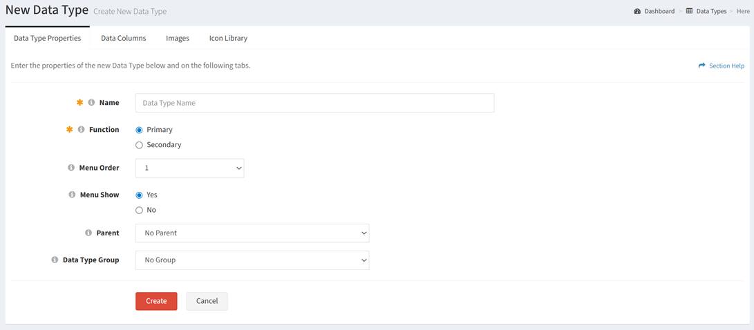
- Name – Enter name of the data type (required)
- Function – Choose the data type function (primary, secondary) (required)
- Menu Order – Select the position of the data type on the navigation menu. Each data type function (primary, secondary, secondary status) is ordered separately.
- Menu Show – Choose if the data type will display or be hidden on the navigation menu
- Parent – Select the parent of the data type to be displayed on the relationship chart
NOTE: The Parent gets applied and displayed on target linked data records. If you are viewing a User record (source) that is linked to three Computers records (target) in different Locations (target has parent set as Location), then the Computer records get the Locations tagged during relationship chart rendering. When viewing a Computer record, you don’t see it because the User record may not have a parent, or if you link other Computer records to another Computer record, those Computer links will draw with Locations. You can set Location as the parent on both User and Computer data types and it would draw on both relationship charts. - Data Type Group – Select the data type group (menu grouping) to assign the data type to
- Add data columns for the new data type on the Data Columns tab
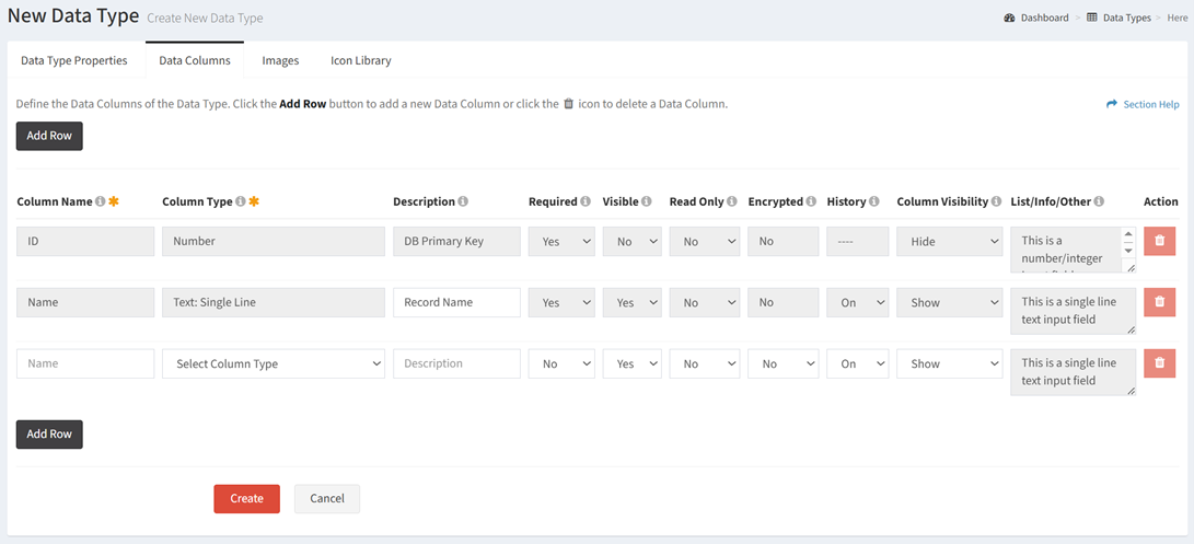
- Column Name – Enter the name of each data column. The column name translates to the field name in the database table. Special characters are not allowed in the column name and will be removed as they are entered. The column name of the ID and Name fields cannot be changed.
- Column Type – Select the type of each data column. The column type of the ID and Name fields cannot be changed.
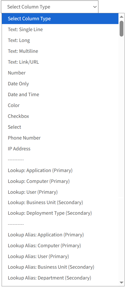
- Text: Single Line – Enter a single line of text (255 characters)
- Text: Long – Enter a single line of text (1,024 characters)
- Text: Multiline – Enter multiple lines of text (65,535 characters)
- Text: Link/URL – Enter link/URL text. The URL must include http:// or https:// to be displayed as a link.
- Number – Enter an integer
- Date Only – Select a date from a calendar (2025-09-03)
- Date and Time – Select a date and time from a calendar (2025 09-03 17:39:00)
- Color – Select the hexadecimal code for a color
- Checkbox – Select Yes or No
- Select – Choose from a predefined list that cannot be changed after creation (e.g. Supported, Not Supported)
- Phone Number – Enter a phone number and extension. One, two, three, and four digit extensions are supported. An extension is not required. One, two, and three digit country codes are supported. Country codes must be entered first and start with a plus sign.
- IP Address – Enter an IPv4 or IPv6 IP address
- Lookup – Choose from a dynamic list (primary or secondary data type) that is managed by adding or removing records from the data types. Primary data types can be lookups to primary or secondary data types. Secondary data types can be lookups to primary or secondary data types as well. Lookups are stored as properties to the data type. This is not to be confused with the linking of data records.
- Lookup Alias – Use the same lookup (with a different name) on an additional column. Choose from a dynamic list (primary or secondary data type) that is managed by adding or removing records from the data types. Primary data types can be lookup aliases to primary or secondary data types. Secondary data types can be lookup aliases to primary or secondary data types as well. Lookup aliases are stored as properties to the data type. This is not to be confused with the linking of data records.
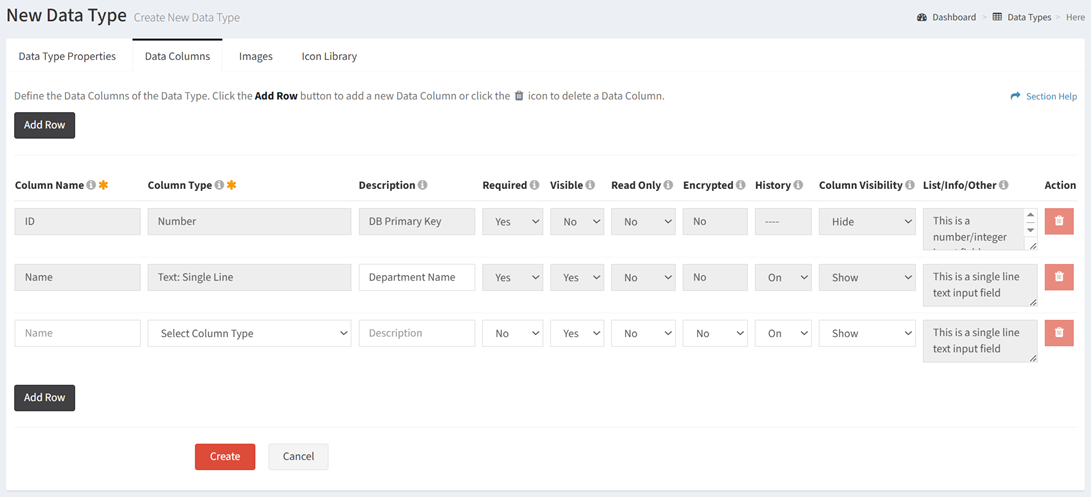
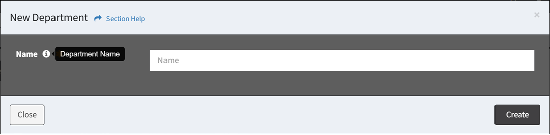
- Description – Enter description of the data column. The description of the ID field cannot be changed; however, the description of the Name field can be changed from the default of Record Name. The description is mirrored from the Name field as it is entered. The description is displayed in the tooltip when adding a new data record. In the example below, “Department Name” has been entered in the description of the Name field. This text is what is displayed in the tooltip of the Name field in the New Department dialog.
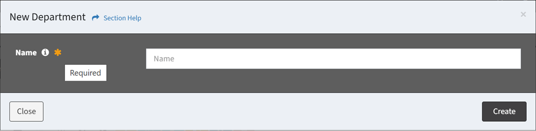
- Required – Choose if the data column is required when creating or editing a data record. A required field is denoted with an orange asterisk when creating or editing. The default setting is No.
- Visible – Choose if the field is visible to the end user. Fields can be removed from view at any point in time. Required fields cannot be removed. The default setting is Yes.
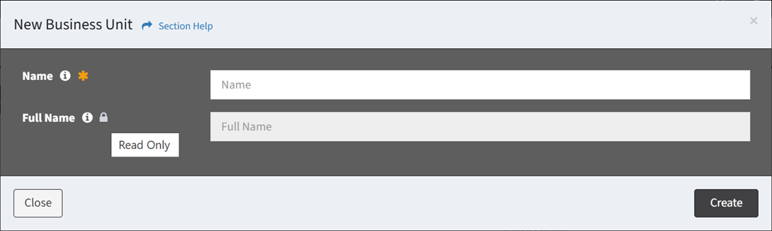
- Read Only – Choose if the field can be edited by the end user. A read only field is denoted with a lock and grayed out when creating or editing. Required fields cannot be read only. The default Setting is No.
- Encrypted – Choose if the field is encrypted in the database. Encrypted fields are masked to the end user and are most commonly used to store credentials. The default setting is No.
NOTE: Encrypting a field makes the data unreadable from the UI and cannot be undone. - History – Choose if the field history (logging) is enabled. The default setting is On.
- Column Visibility – Choose if the field is shown or hidden. Unhide columns using Column Visibility on the toolbar. The default setting is Show.
- List/Info/Other – Provides additional configuration options for a subset of the column types.
- Number – Decimal Places (0 to 6), the default setting is 0
- Select – Define the values in the list (one item per line)
- IP Address – Version (IPv4 or IPv6), the default is IPv4
- Lookup – Allow Multiple (No or Yes), the default setting is No
- Lookup Alias – Allow Multiple (No or Yes), the default setting is No
- Action – Delete a row before it is saved to the data type
- Add Row – Add new rows for additional data columns
NOTE: Data columns will be created for Data Links and Waves fields for primary data types only (not secondary).
- Select and upload icons for the navigation menu and relationship charts for the new data type on the Images tab
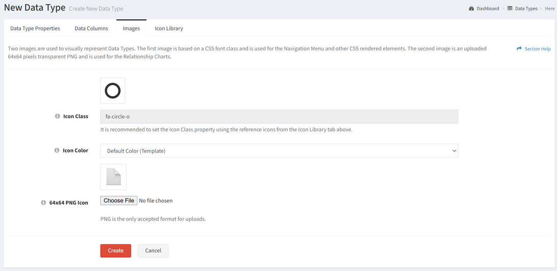
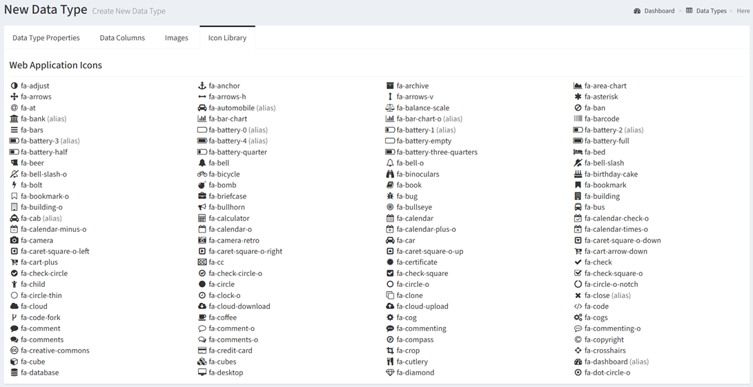
- Icon Class – Select a navigation menu icon for the data type from the icon library. The full list of icons can be found on the Icon Library tab.
- Icon Color – Select a color for the icon on the navigation menu (white, yellow, red, blue, green, purple)
- PNG Icon – Upload a chart icon for the data type. The icon must be in PNG format.
- Icon Class – Select a navigation menu icon for the data type from the icon library. The full list of icons can be found on the Icon Library tab.
- Click the Create button when finished to create the data type. You will be redirected back to the Data Types page. Click the Cancel button to cancel the operation.