
Search Knowledge Base by Keyword
-
Introduction
-
Fundamentals
-
My ReadyWorks
-
Analytics
-
-
-
- Available Reports
- All Data Types
- Application Certification Status
- Application Discovery
- Application Group Analysis
- App Group to SCCM Collection Analysis
- Application Install Count
- Application License Management
- Application Usage
- Data Type Column Mappings
- Record Count by Property
- Data Links Count by Data Type
- Build Sheet
- Computer User Assignment
- Delegate Relationships
- ETL5 Staging Data
- Migration Readiness (Basic)
- Migration Readiness (Complex)
- O365 License Management
- O365 Migration Readiness
- Patch Summary
- SCCM OSD Status
- Scheduled Computers by Wave
- Scheduled Users by Manager
- User Migration Readiness
- VIP Users
- Wave & Task Details
- Wave Group
- Windows 10 Applications
- Show all articles ( 14 ) Collapse Articles
-
-
-
-
Orchestration
-
Data
-
-
- View Primary Data
- Record Properties
- Images
- Notes
- Waves
- Tasks
- Attachments
- History
- Rationalization
- QR Code
- Linked Records
- SCCM Add/Remove Programs
- Altiris Add/Remove Programs
- Related Records
- Advanced Search
- Relationship Chart
- Primary Data Permissions
- Show all articles ( 2 ) Collapse Articles
-
Integration
-
-
-
- View Connection
- Connection Properties
- Make Into Connector
- Delete Connection
- Connection Error Settings
- Inbound Jobs
- Outbound Jobs
- New Inbound Job
- New Outbound Job
- Job Error Settings
- Enable Job
- Disable Job
- Edit Inbound Job
- Edit Outbound Job
- Upload File
- Run Inbound Job
- Run Outbound Job
- Set Runtime to Now
- Reset Job
- Delete Job
- Job Log
- Show all articles ( 6 ) Collapse Articles
-
-
- View Connector
- Connector Properties
- Authentication Methods
- New Authentication Method
- Authentication Method Error Settings
- Edit Authentication Method
- Delete Authentication Method
- Fields
- Edit Field
- Inbound Job Fields
- Edit Inbound Job Field
- Inbound Job Templates
- New Inbound Job Template
- Job Template Error Settings
- Edit Inbound Job Template
- Delete Inbound Job Template
- Outbound Job Fields
- Edit Outbound Job Field
- Outbound Job Templates
- New Outbound Job Template
- Edit Outbound Job Template
- Delete Outbound Job Template
- Show all articles ( 7 ) Collapse Articles
-
-
- ETL5 Connector Info
- Absolute
- Azure Active Directory
- Comma-Separated Values (CSV) File
- Generic Rest JSON API
- Generic Rest XML API
- Ivanti (Landesk)
- JAMF
- JSON Data (JSON) File
- MariaDB
- Microsoft Endpoint Manager: Configuration Manager
- Microsoft SQL
- Microsoft Intune
- Oracle MySQL
- PostgreSQL
- Pure Storage
- ServiceNow
- Tanium
- XML Data (XML) File
- JetPatch
- Lenovo XCLarity
- Nutanix Move
- Nutanix Prism
- Nutanix Prism - Legacy
- RVTools
- Simple Object Access Protocol (SOAP)
- VMware vCenter
- VMware vCenter SOAP
- Show all articles ( 13 ) Collapse Articles
-
-
Admin
-
-
-
- Modules
- Attachments
- Bulk Edit
- Data Generator
- Data Mapping
- Data Quality
- ETL
- Form Builder
- Images
- Multi-Factor Authentication
- Notifications
- Rationalization
- Relationship Chart
- Reports
- Rules
- Single Sign-On
- T-Comm
- User Experience
- Show all articles ( 4 ) Collapse Articles
-
-
API
-
Administration
-
FAQs
-
Solutions
New Form
< Back
From the Form Builder page, you can create new forms. To create:
- Click the New Form button to bring up the New Form wizard
- Enter the properties of the new form on the Form Properties tab
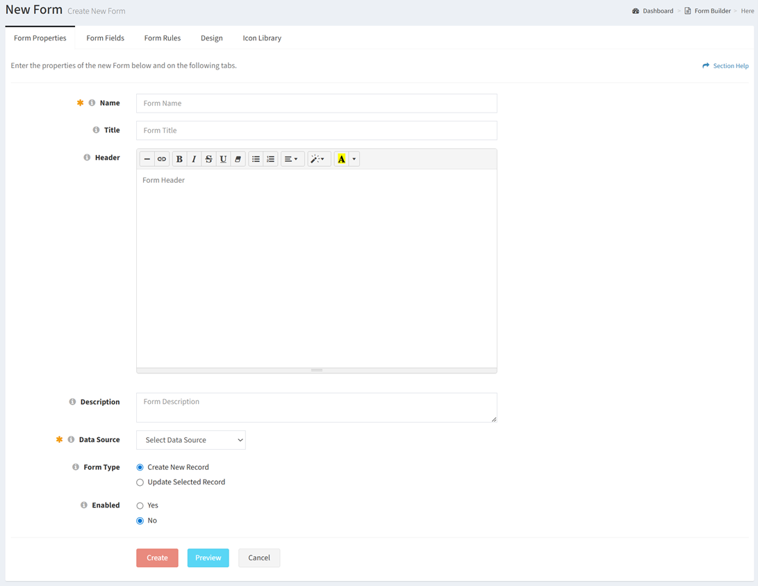
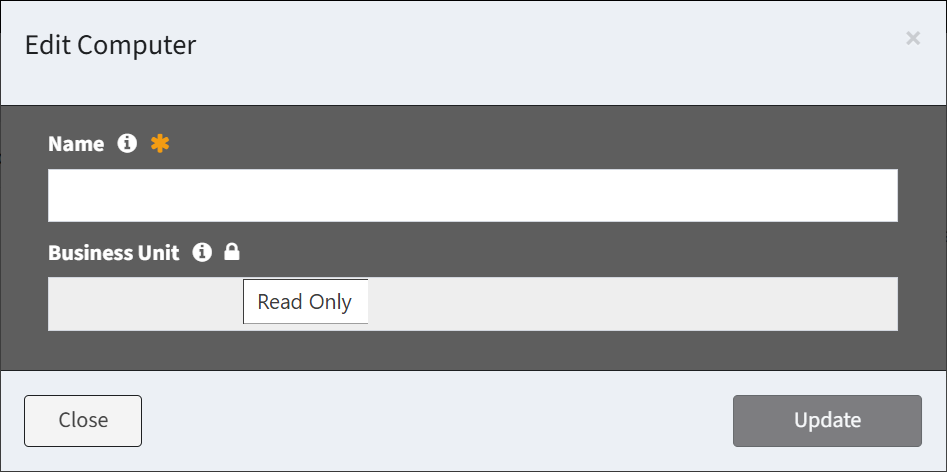
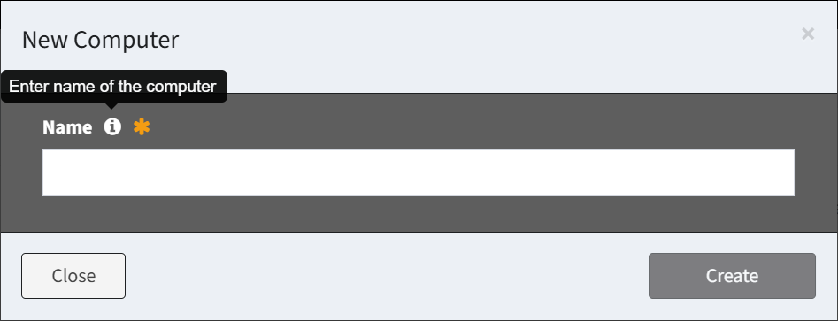
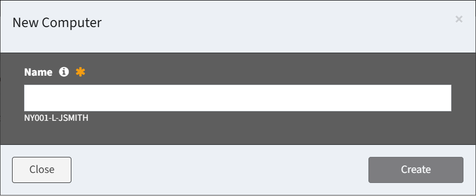
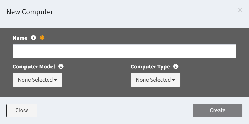
- Name – Enter name of the form (required)
- Title – Enter title of the form (optional)
- Header – Enter header of the form displayed below the title (optional)
- Description – Enter description of the form (optional)
- Data Source – Select the data source of the form (e.g., Computer data type) (required)
- Form Type – Choose the type of the form (Create New Record, Update Selected Record) (required)
- Enabled – Choose if the form is enabled (required)
- Add fields to the new form on the Form Fields tab
- Click the Add Field button to add fields to the form
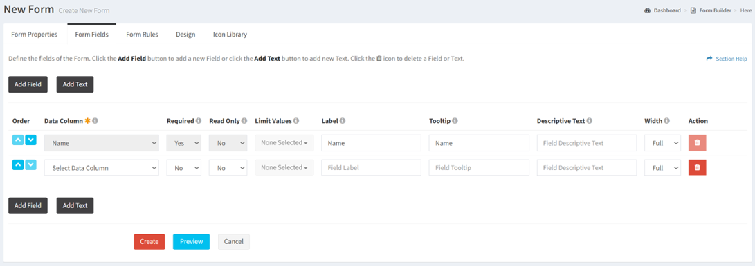
- Order – Change the order of the fields
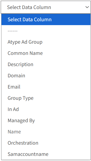
- Data Column – Select the data column of each field. Previously selected data columns are displayed in italics. The data column of the Name field cannot be changed.
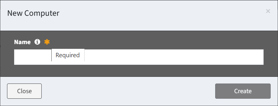
- Required – Select if the field is required when creating or editing. A required field is denoted with an orange asterisk when creating or editing. The Name field is required and cannot be changed. The default setting is No.
- Read Only – Select if the field can be edited. A read only field is denoted with a lock and grayed out when creating or editing. Required fields cannot be read only. The default Setting is No.
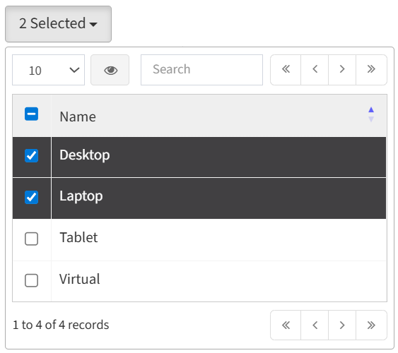
- Limit Values – Select the values (Lookup data columns only) to limit the available selections in the drop down menu (e.g., only display Desktop and Laptop in the Computer Model drop down)
- Label – Enter the label of each field
- Tooltip – Enter the tooltip of each field
- Descriptive Text – Enter the descriptive text of each field
- Width – Select the width of each field (full, half)
- Action – Delete a row before it is saved to the form
- Add Field – Add new rows for additional fields
- Click the Add Text button to add text fields to the form
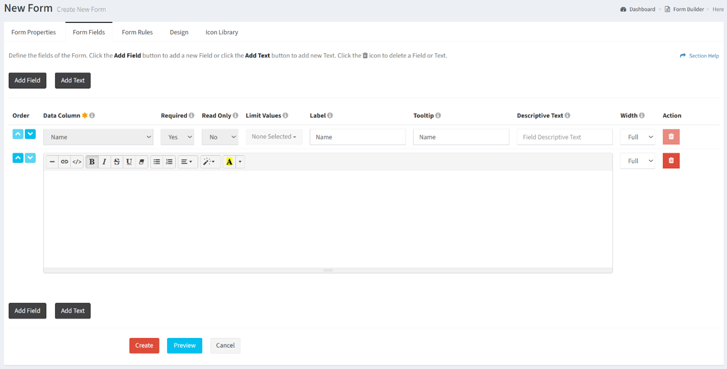
- Text – Enter the text of each text field
- Width – Select the width of the text field (full, half)
- Action – Delete a row before it is saved to the form
- Add Text – Add new rows for additional text
- Click the Add Field button to add fields to the form
- Define how fields on the form are displayed or hidden on the Form Rules tab
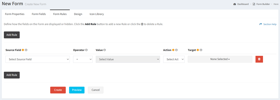
- Source Field – Select the source field (drop downs only) of the rule
- Operator – Select the operator of the rule (equals, not equals)
- Value – Select the source value to match
- Action – Select the action to apply to the target when the source value matches (disable, show)
- Disable – Disable the target on the form (target is enabled when the form opens)
- Show – Display the target on the form (target is hidden when the form is opened)
- Target – Select the targets of the action. Targets include any field (aside from the source field) and the submit button.
- Action – Delete a row before it is saved to the form
- Add Rule – Add new rows for additional rules
- Define the look and feel of the new form on the Design tab
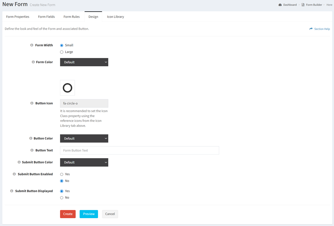
- Form Width – Choose the width of the form (small, large)
- Form Color – Select the color of the form (black, green, light blue, red, yellow)
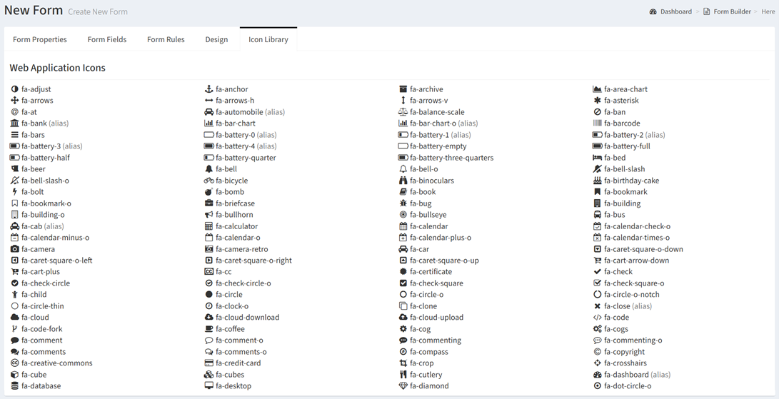
- Button Icon – Select an icon for the form button (displayed on reports) from the icon library. The full list of icons can be found on the Icon Library tab.
- Button Color – Select the color of the form button (blue, green, light blue, red, yellow)
- Button Text – Enter the name of the form button
- Submit Button Color – Select the color of the submit button on the form (black, green, light blue, red, yellow)
- Submit Button Enabled – Choose if the submit button is enabled on the form. When disabled, the form is displayed in a read only mode.
- Submit Button Displayed – Choose if the submit button is displayed on the form
- Click the Preview button to preview the form before saving. Click the Close button to exit the form preview.
- Click the Create button when finished to create the form. You will be redirected back to the Form Builder page. Click the Cancel button to cancel the operation.